Most statisticians would look askance at anyone drawing conclusions from a small sampling, but sometimes a few people can really shed light where it's needed. Eight people have so far responded to the Lowell Hill Pottery Survey and while I hope more do, I have some data to work with.
I also have work to do!
By a large margin, the most popular glaze color is Ducks Head Black. That's a little surprising to me, but only a little. It is a very unusual glaze with a wonderful character. While it is not yet available for production, its reformulation is the first item on the agenda once I get the water turned back on for the warm season (which I expect to do next week). The science is on paper right now, and I am sure only a few passes will be needed to get a glaze that looks as it should. But then the safety tests will have to be done. Black is a difficult color to formulate and make hard and permanent. But two customers have already called this year to inquire about Ducks Head, so it will take center stage until it is ready to go.
Ducks Head and Turquoise was the next most popular pattern. The Turquoise is all formulated and in production, so once the Ducks Head is ready, this will be a snap.
What really surprised me was the popularity of the Jonquil Yellow glaze. It is as popular as the Turquoise and the Black and Seagull pattern. I have already had on inquiry about it and will begin reformulation very soon. In fact, Yellow is a variant of the white formula, so the base glaze is finished. All I need to do is establish the right amounts of colorant. Then the tests, of course. You have to do the tests.
I am halfway to a good workable Seagull, which I will try along with the new Ducks Head. Rowantrees had stopped using the Black glaze by the time production ceased in 2008, but I am not beyond recreating it. Still, the blue interface between Ducks Head and Seagull is very attractive.
So the plan starting in early May is set. Ducks Head and Yellow need to be addressed.
I will also start bisque ware production. You may recall that I decided to increase the firing temperature last year. This was largely because the glazes were having fit problems at the original firing temperatures on the new clay body. Increasing the temperature a little solved that problem for most of the glazes. But raising the firing temperature caused the older Rowantrees bisque ware to shrink excessively, making the final product too small. For that reason, I abandoned the plan of using up the remaining bisque stock that existed at Rowantrees. I will start from scratch, whis is a bit daunting, but not terribly so.
This move also gives me a chance to advance the firing temperatures even more. The new clay can be fired at much higher temperatures than the old, and the higher I go, the more durable the final product. I see no reason not to head for the top temperature as I go forward.
That move may, of course, require more adjustments to the glaze formulas, but it might not. I'll be finding out soon!
I'll be posting more very soon as there were some comments that I want to answer here. The conversation is a thrill. Getting feedback during the creative process is a wonderful way to find out what is needed.
More later...
Thursday, April 28, 2011

Saturday, March 12, 2011
We're on Facebook!
Lowell Hill Pottery has joined the online social media revolution. Yes, I finally swallowed hard and put up a Facebook page for the pottery. Please visit the Lowell Hill Pottery Facebook Page and let us know you were there.
And if you like it, please "like" it and tell all your friends about it. The word is like butter. It's best when you spread it!
And if you like it, please "like" it and tell all your friends about it. The word is like butter. It's best when you spread it!
The Word Has Gone Out!
The first mailing for Lowell Hill Pottery has been sent. It's just a postcard, but the intent is to let people know that I am here and gearing up for production. I don't know how many Rowantrees customers have heard the news, but in case some have not, they will soon.
So this post is for those who have just tuned in. I encourage you to read as much of this blog as you can. Then by all means, check out my web site.
If you have found your way to this blog and are trying to find the web site, you can click on the dinnerware picture to the right or on this link:
Lowell Hill Pottery
I am also looking for input still. My survey is still up and will remain there for some time to come. You can find it here:
Lowell Hill Pottery Customer Survey
The more I know about your wants and desires, the better equipped I will be to meet them!
On a couple of notes (progress wise), it is clear that Duckshead Black is a very popular glaze. At this point in time, I do not have a replacement formulated that satisfies me.That is due only tot he fact that the pottery has been closed for the winter because there is no heat in the building. As soon as temperatures rise above the freezing point for good, I will be back in there working on this issue. The black glaze I was using in combination with Moss Agate and Turquoise will not work any longer as I have increased my firing temperature (more on that in a minute). So there is nothing for it but to work from existing notes to develop a replacement from scratch. It should not take very long. The experience I have gained int he last year will serve well.
Why go to all this trouble?
Many of you may recall the the original Rowantrees Duckshead was what was known as a "scrape-up" glaze. It was made using remainders of glazes that were scraped off the bottoms of pots and the inside of the glazing booth and that were combined and augmented with coloring oxides to produce the unique black glaze with the slight gun metal sheen. Reproducing this is a challenge for a few reasons. First, using scrape-up material means that the exact formula of the glaze changes each and every time it is mixed. Over its history, Duckshead changed in appearance quite a lot. It was only when Sheila Varnum standardized the recipe that firing results were more consistent. Still, in using left overs, it can be difficult to recreate the glaze appearance reliably each time. Consistency is made even more difficult when metallic oxides are added to produce a black glaze. Adding too much can make the glaze soft and prone to leaching. While this doesn't necessarily mean a safety problem, it will cause pottery to become dull with use. If you bought a particular glaze pattern for its beautiful shine, you probably want it to stay shiny throughout its life.
So going back to formula and creating a replacement Duckshead that is exactly the same chemistry from batch to batch is the best way to make certain that the reproduction is faithful to the beautiful Duckshead that Sheila Varnum ultimately created. It also assures that Lowell Hill Pottery will produce a Duckshead that is durable and hard.
This also means that Lowell Hill Pottery can use the scrape up remainders of its glazes over again. White scrape up can be reused for white pottery and such. So the lack of scrape up glazed does not mean the end of recycling!
Another way to assure durability is to fire the clay to the highest temperature that it can sustain. Because Lowell Hill Pottery is using a clay that is different than the original Rowantrees (details in an earlier post), I want to make certain to vitrify the clay as completely as possible. A higher temperature makes for more durable pottery because moisture can not work its way into the finished product.
The philosophy is simple. Lowell Hill Pottery can not improve on the designs of Rowantrees Pottery, but we can do all that is possible to preserve its beauty and improve on its durability. By this effort, Lowell Hill Pottery can preserve the heritage of Rowantrees far into the future.
Welcome and enjoy the ride!
So this post is for those who have just tuned in. I encourage you to read as much of this blog as you can. Then by all means, check out my web site.
If you have found your way to this blog and are trying to find the web site, you can click on the dinnerware picture to the right or on this link:
Lowell Hill Pottery
I am also looking for input still. My survey is still up and will remain there for some time to come. You can find it here:
Lowell Hill Pottery Customer Survey
The more I know about your wants and desires, the better equipped I will be to meet them!
On a couple of notes (progress wise), it is clear that Duckshead Black is a very popular glaze. At this point in time, I do not have a replacement formulated that satisfies me.That is due only tot he fact that the pottery has been closed for the winter because there is no heat in the building. As soon as temperatures rise above the freezing point for good, I will be back in there working on this issue. The black glaze I was using in combination with Moss Agate and Turquoise will not work any longer as I have increased my firing temperature (more on that in a minute). So there is nothing for it but to work from existing notes to develop a replacement from scratch. It should not take very long. The experience I have gained int he last year will serve well.
Why go to all this trouble?
Many of you may recall the the original Rowantrees Duckshead was what was known as a "scrape-up" glaze. It was made using remainders of glazes that were scraped off the bottoms of pots and the inside of the glazing booth and that were combined and augmented with coloring oxides to produce the unique black glaze with the slight gun metal sheen. Reproducing this is a challenge for a few reasons. First, using scrape-up material means that the exact formula of the glaze changes each and every time it is mixed. Over its history, Duckshead changed in appearance quite a lot. It was only when Sheila Varnum standardized the recipe that firing results were more consistent. Still, in using left overs, it can be difficult to recreate the glaze appearance reliably each time. Consistency is made even more difficult when metallic oxides are added to produce a black glaze. Adding too much can make the glaze soft and prone to leaching. While this doesn't necessarily mean a safety problem, it will cause pottery to become dull with use. If you bought a particular glaze pattern for its beautiful shine, you probably want it to stay shiny throughout its life.
So going back to formula and creating a replacement Duckshead that is exactly the same chemistry from batch to batch is the best way to make certain that the reproduction is faithful to the beautiful Duckshead that Sheila Varnum ultimately created. It also assures that Lowell Hill Pottery will produce a Duckshead that is durable and hard.
This also means that Lowell Hill Pottery can use the scrape up remainders of its glazes over again. White scrape up can be reused for white pottery and such. So the lack of scrape up glazed does not mean the end of recycling!
Another way to assure durability is to fire the clay to the highest temperature that it can sustain. Because Lowell Hill Pottery is using a clay that is different than the original Rowantrees (details in an earlier post), I want to make certain to vitrify the clay as completely as possible. A higher temperature makes for more durable pottery because moisture can not work its way into the finished product.
The philosophy is simple. Lowell Hill Pottery can not improve on the designs of Rowantrees Pottery, but we can do all that is possible to preserve its beauty and improve on its durability. By this effort, Lowell Hill Pottery can preserve the heritage of Rowantrees far into the future.
Welcome and enjoy the ride!
Monday, February 28, 2011
The Die is Cast
Well, a die is cast anyway. Two of them to be more precise.
The experimentation has been progressing well. I think I have plaster mixing and pouring down to a near science at the very least. Here is a picture of the die that I have made for the Portland Head Light tile:
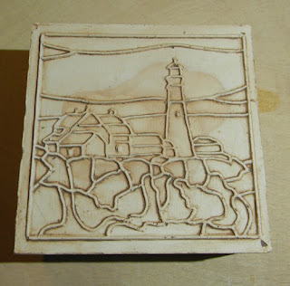 It still needs to be cleaned up and sanded around the edges to finish it off, but I seem to have the technique (or at least my technique) down. I made two of these dies and hope to have this tile design in production before another month is out. I am also working on a die to stamp my maker's mark into the back.
Portland Head and Whaleback lights are the first two lighthouses to get this treatment,but I am planning on a road trip this summer to take pictures a several more. Fort Point Light will get attention next. It has a wonderful keeper's house and is unusual for its square light tower.
I am casting these dies using leather hard clay instead of bisque. Wile bisque would last longer (I can get two casts easily with leather hard - probably more if I make the slab thicker), I can turn on a dime with unfired clay. I roll the slab and incise it the first day, leave it between two sheets of drywall overnight, and then clean up the image the second day and do the casting. The raw clay peels away from the plaster easily after about an hour and is generally ready for another impression as soon as I clean it off.
I will be working on a mold to make larger trivet sized versions of the Portland Head and Whaleback lights. These will be int he neighborhood of 6.5 to 7 inches square and will sit on cork feet.
I'm doing all I can to stay active these days. This has been the most relentless winter I can remember. I have to go back to 1968 to find one in memory that came close. I recall the snowbanks so high that we would walk on top of them because you could not see the street from the sidewalk. It was the first year that I had to attend school on a Saturday because so many days had been called off.
You can't help but be affected by this. My back is still screeching at me because of the shoveling I did this weekend. I'm 52 now, so I know I have to be careful, but I'm a one-man show here on top of Lowell Hill, so there you are.
Keeping busy at some pursuit other than the mundane is essential. Small breakthroughs like successful die casting can do a lot to raise the spirits.
More soon!
The experimentation has been progressing well. I think I have plaster mixing and pouring down to a near science at the very least. Here is a picture of the die that I have made for the Portland Head Light tile:
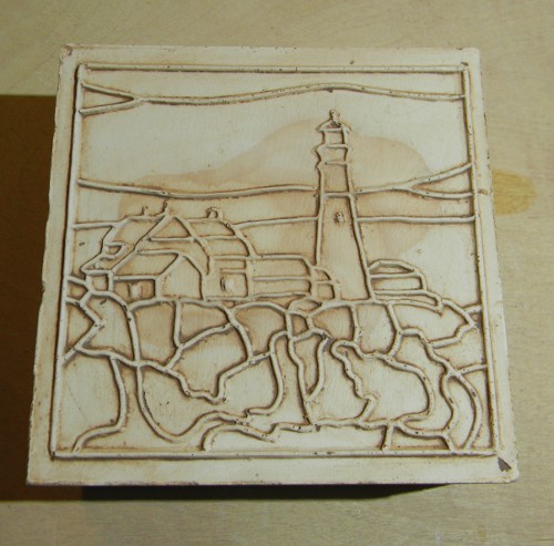
Portland Head and Whaleback lights are the first two lighthouses to get this treatment,but I am planning on a road trip this summer to take pictures a several more. Fort Point Light will get attention next. It has a wonderful keeper's house and is unusual for its square light tower.
I am casting these dies using leather hard clay instead of bisque. Wile bisque would last longer (I can get two casts easily with leather hard - probably more if I make the slab thicker), I can turn on a dime with unfired clay. I roll the slab and incise it the first day, leave it between two sheets of drywall overnight, and then clean up the image the second day and do the casting. The raw clay peels away from the plaster easily after about an hour and is generally ready for another impression as soon as I clean it off.
I will be working on a mold to make larger trivet sized versions of the Portland Head and Whaleback lights. These will be int he neighborhood of 6.5 to 7 inches square and will sit on cork feet.
I'm doing all I can to stay active these days. This has been the most relentless winter I can remember. I have to go back to 1968 to find one in memory that came close. I recall the snowbanks so high that we would walk on top of them because you could not see the street from the sidewalk. It was the first year that I had to attend school on a Saturday because so many days had been called off.
You can't help but be affected by this. My back is still screeching at me because of the shoveling I did this weekend. I'm 52 now, so I know I have to be careful, but I'm a one-man show here on top of Lowell Hill, so there you are.
Keeping busy at some pursuit other than the mundane is essential. Small breakthroughs like successful die casting can do a lot to raise the spirits.
More soon!
Friday, February 11, 2011
Another Art Update
The more you work at something, the more you learn. I have been working with the tile art for both the Whaleback and Portland Head tiles. One thing became glaringly clear. Tiles of any size with a mosaic pattern on them need to be impressionistic. Realism just won't fit, and even if it does, it will be impossible to paint because the detail will be too small.
Needless to say, some reworking has taken place. Here is what the tiles look like now:

 Mind you, the line below the rocks on the Whaleback tile will be restored. I'm still playing around with placement on that one.
Note too that the names have been removed. They just took up too much space and interrupted the - what's a good word - flow of the art. I may put the names on the back, or assuming someone may actually want to mount one of these in a splash back someday, I may create a small card for each with a little history on each lighthouse. In any case, I wanted the tiles cleaner than text would allow.
Did you ever read "The Little Red Lighthouse and the Great Gray Bridge" by Hildegarde Swift and Lynd Ward when you were young? It's a story of (you guessed it) a little red lighthouse that guarded the shores of the Hudson River and kept ships safe from the rocks. It was very proud of the job it did. When a giant gray bridge is built right over it, the lighthouse believes that it has become insignificant. When a beacon shines from the bridge to light the river, the lighthouse is convinced that it is no longer useful. Then one night, a storm endangers ships by gripping them in fog. A tug crashes on the rocks because it can not see the beacon shining from atop the bridge. The bridge calls out to the lighthouse to shine its light and sound its fog bell. When the keeper arrives, the lighthouse is lit and the bell sounds out. Then the little red lighthouse discovers that small does not mean insignificant. It regains its pride in its function.
I must have missed the part of the book that told the reader to travel up Riverside Drive in New York City to visit the little red lighthouse. It is, in fact, properly known as the Jeffrey's Hook Light. It sits beneath the George Washington Bridge and is a New York City landmark.
I know my tile project focuses on Maine lighthouses, but this one seems a good exception. The artwork is currently in process after having received several pictures of the lighthouse from a friend with permission to use them as I see fit.
It's a great story and was one of my favorites when growing up.
Needless to say, some reworking has taken place. Here is what the tiles look like now:

Note too that the names have been removed. They just took up too much space and interrupted the - what's a good word - flow of the art. I may put the names on the back, or assuming someone may actually want to mount one of these in a splash back someday, I may create a small card for each with a little history on each lighthouse. In any case, I wanted the tiles cleaner than text would allow.
Did you ever read "The Little Red Lighthouse and the Great Gray Bridge" by Hildegarde Swift and Lynd Ward when you were young? It's a story of (you guessed it) a little red lighthouse that guarded the shores of the Hudson River and kept ships safe from the rocks. It was very proud of the job it did. When a giant gray bridge is built right over it, the lighthouse believes that it has become insignificant. When a beacon shines from the bridge to light the river, the lighthouse is convinced that it is no longer useful. Then one night, a storm endangers ships by gripping them in fog. A tug crashes on the rocks because it can not see the beacon shining from atop the bridge. The bridge calls out to the lighthouse to shine its light and sound its fog bell. When the keeper arrives, the lighthouse is lit and the bell sounds out. Then the little red lighthouse discovers that small does not mean insignificant. It regains its pride in its function.
I must have missed the part of the book that told the reader to travel up Riverside Drive in New York City to visit the little red lighthouse. It is, in fact, properly known as the Jeffrey's Hook Light. It sits beneath the George Washington Bridge and is a New York City landmark.
I know my tile project focuses on Maine lighthouses, but this one seems a good exception. The artwork is currently in process after having received several pictures of the lighthouse from a friend with permission to use them as I see fit.
It's a great story and was one of my favorites when growing up.
Monday, January 31, 2011
Tile Update
I have done more work on the tile design for Whaleback Light and added new artwork for Portland Head Light. Here are the line drawings.
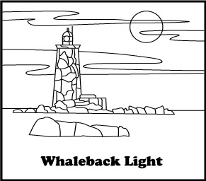
 The ocean in each of these tiles will be roughed out when the original is cut. I like an active, choppy sea that provides some motion. I'm hoping to get the appearance of sea spray by stippling as well. But it has to be doable in a short period of time.
Making these in four-inch sizes will probably necessitate some simplification of the mosaic design so that the hand decoration doesn't take too long. I am also thinking of making a larger trivet size, which would allow for more detail. Time and experimentation will tell, but just looking at the close tolerances of the light keeper's house on Portland Head give me the shivers. It's instantly recognized - the light being as iconic as it is - so getting it right is important.
But it's nice to have artwork to look at and work from.
Making these in four-inch sizes will probably necessitate some simplification of the mosaic design so that the hand decoration doesn't take too long. I am also thinking of making a larger trivet size, which would allow for more detail. Time and experimentation will tell, but just looking at the close tolerances of the light keeper's house on Portland Head give me the shivers. It's instantly recognized - the light being as iconic as it is - so getting it right is important.
But it's nice to have artwork to look at and work from.
Sunday, January 30, 2011
Pressing Matters
The tile making process took another big step ahead this weekend with the building of my tile press. I'm no engineer, but I have to say I'm rather pleased with this effort. As with any other project like this, I sort of designed it as I bought the parts. It's not the most efficient way of doing things, but when it comes to any sort of machine work, I tend to do better learning the ropes while I do things.
I knew I needed an arm with a spring for return. I also knew I needed an upright for the arm to pivot in. Then there is the press foot. Those were the essential three pieces for the press. Once I had them in place, I discovered that a guide arm would be necessary to keep the press foot from swinging as it raised and lowered. I would also need to figure out where I wanted the action to start and finish.
It was actually a lot of fun to observe this simple machine in action and determine what enhancements would be needed. It was worth the four trips to the hardware store it necessitated.
 Potters may notice that the arm and press foot are made of parts from an old Bailey hand extruder. I modified them by drilling a few holes and moving parts around a bit.
Drilling through tool steel with a hand drill is such fun. But if you're looking for a handy shop tip, here is a great discovery I made: olive oil makes a great cutting oil.
This press will work best for smaller tiles. There are better methods for making larger ones and I will be making molds for those in the near future. What I have to set about doing now is making originals to cast molds from. In my last post, I included a picture of the first die I made. It's rather big for a press like this unless working with pretty soft clay. Still, I gave it a try to see how the process works. Here is the result (before edge cleaning).
 Not at all bad for a very first attempt.
Regarding originals from which to cast dies, I have started artwork on a series of tiles featuring lighthouses in Maine. They will be mosaic in design like the dove tile above. While there is still quite a bit to do on it, here is a preliminary layout for a tile featuring Whaleback Light. I sill want to add rocks to the foreground and clouds to the sky. The clouds will obscure the moon a bit for effect.
 Mind you, the typeface will change. It's just there as a place holder, but I do plan on putting the name of each light on the tile.
But things are once again off and running!
I knew I needed an arm with a spring for return. I also knew I needed an upright for the arm to pivot in. Then there is the press foot. Those were the essential three pieces for the press. Once I had them in place, I discovered that a guide arm would be necessary to keep the press foot from swinging as it raised and lowered. I would also need to figure out where I wanted the action to start and finish.
It was actually a lot of fun to observe this simple machine in action and determine what enhancements would be needed. It was worth the four trips to the hardware store it necessitated.

Drilling through tool steel with a hand drill is such fun. But if you're looking for a handy shop tip, here is a great discovery I made: olive oil makes a great cutting oil.
This press will work best for smaller tiles. There are better methods for making larger ones and I will be making molds for those in the near future. What I have to set about doing now is making originals to cast molds from. In my last post, I included a picture of the first die I made. It's rather big for a press like this unless working with pretty soft clay. Still, I gave it a try to see how the process works. Here is the result (before edge cleaning).
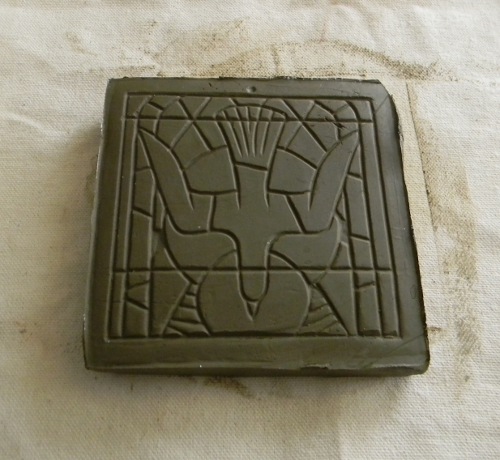
Regarding originals from which to cast dies, I have started artwork on a series of tiles featuring lighthouses in Maine. They will be mosaic in design like the dove tile above. While there is still quite a bit to do on it, here is a preliminary layout for a tile featuring Whaleback Light. I sill want to add rocks to the foreground and clouds to the sky. The clouds will obscure the moon a bit for effect.
But things are once again off and running!


Subscribe to:
Posts (Atom)